

Brand Story
I grew up in Orlando, Florida, skateboarding with some good dudes and sharing many formative experiences. Blood on pavement catalyzed countless lessons in resilience, determination, adaptable ingenuity, and risk/reward/skill level assessment. These are qualities I carry over into many areas of my life and wanted my brand to communicate.
Art surrounding skate culture inspired much of my early interest in graphic design and visual expression. From the art to the discipline, it's rich in style and diversity with an inclusive and evolving community who push each other to try new things and reach new levels. However you roll, there’s one thing the real ones know. Scars and scuffs are a skater’s pride. They’re the remnants of hard work, faced fear, and resolve. The type of damage a board takes tells a story about the rider and how they skate. The damage doesn’t define us; how we faced the moment does. So we send it.
Logo Mark
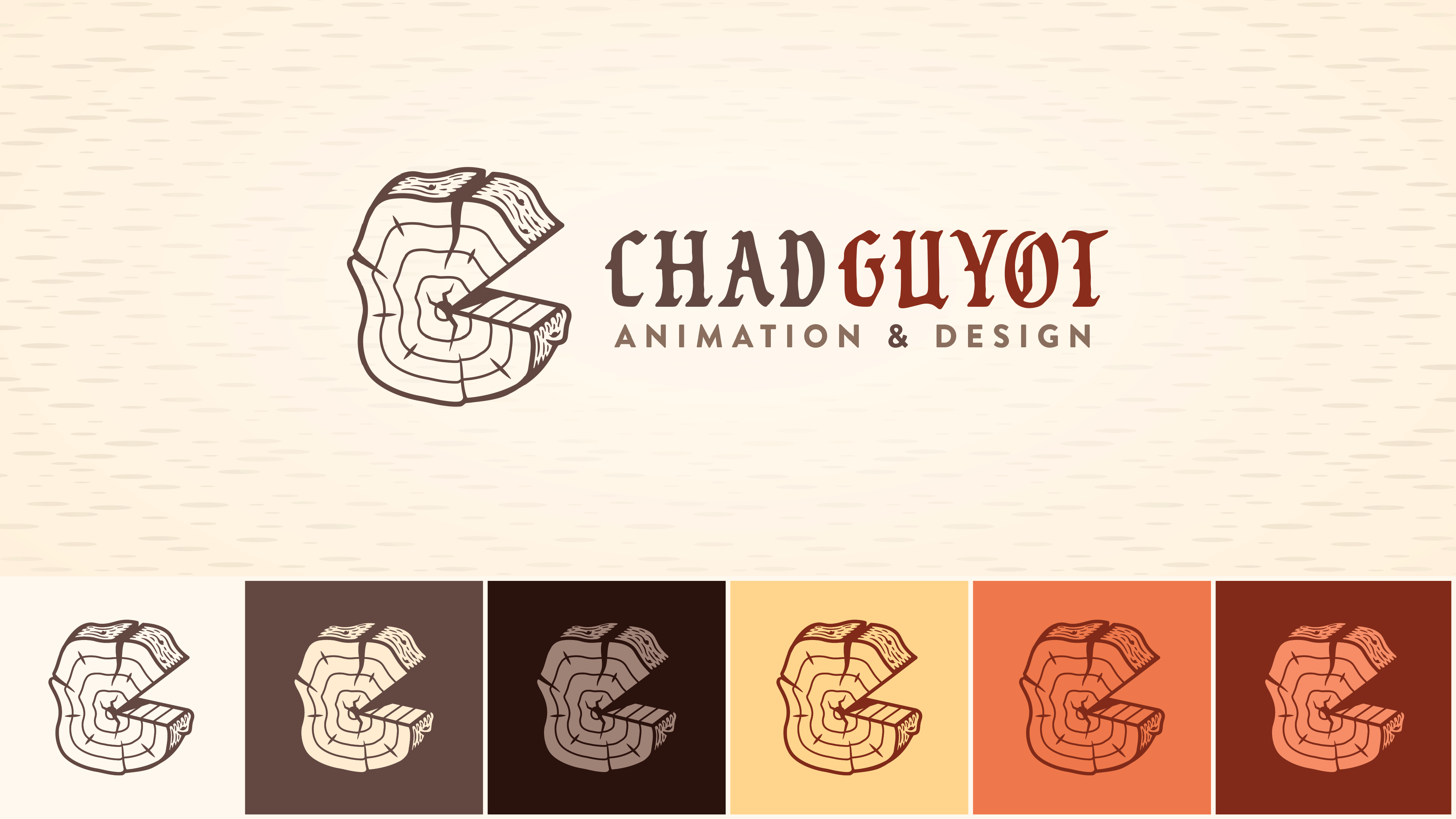
This logo uses juxtaposition to create visual interest and a distinct impression. The organic nature of the tree slice, paired with an improbably geometric portion missing, implies a story through visual tension.

Evolution
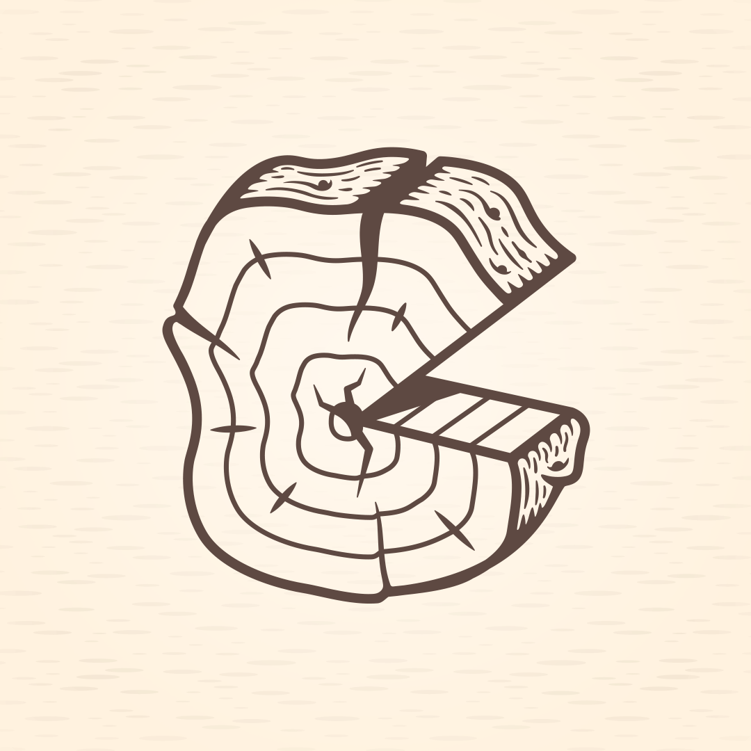
As a student in 2014, I developed this concept because of my interest in wood textures and the implications those visuals evoke. The life rings of the tree, reminiscent of a “C” and “G,” were also an attempt to visually associate it with my name.
In 2018, unhappy with prior logo iterations, I accepted that this would be a lifelong process. I promised myself that with each new iteration of my logo, the tree slice would be more thrashed, while the design itself would become more polished. That’ll be the challenge. Hopefully, among the destruction, I’ll find growth.
